Mushroom Queen wrote:
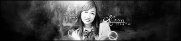
I'd like to see a border and text. I kind of liked the first one because it looked like there was fire behind her. The second looks a little washed out. Other than that, good job.
Yeah, I really should add text to what I do. I do my best texts when I insert it halfway through the sig-making process, and edit the words along with the sig itself, but I do my best sig work when I just focus on the sig itself and leave out the text. I should probably practice using text, but I find my best work is done at a simple level. Text makes the meaning of a sig obvious, sometimes the sig itself should speak to you. You know?
Yeah, I do need a border. In my photoshop file it looks like the "fade out" effect on the sides covers it well and works as a border, but on here it doesn't really appear that way.


