Sev wrote:
PhoenixEmpire wrote:
filter->sharpen. It can be a miracle worker.
but yeah, since really you just lazily photomaniped a pic (and i use lazily as a compliment, laziness is a virtue in my book), it's really simple. I mean, simple is good, but it's still...just missing something. The text needs to say "WAM BAM THANK YOU MAM". It needs to scream "WE ARE TEH L33T". Now it's just like "ooo, we're strong and have nice handwriting..."
Oh god, the sharpen makes it look A LOT better. Thanks for that

Now the only problem is finding a good text for it, I can't seem to decide, I'll keep looking though.
Edit: Hows this?
http://img291.imageshack.us/my.php?image=never2fk4.pngMr Lich King Never looked so shiney. And I think I found a nice font

That looks great

Sharpen is completely under-rated. It's honestly what I do at the end of every sig.
Get a sig or banner how you think it looks good, then get it a nice sharpen and it looks 10x better.
But yeah, text takes some time to get good at. Banners are even harder, because text is more of an element of the banner itself and adds a whole new prospect to it. It's really hard to pic fonts, but you eventually figure out what font looks best with what style )and that style isn't always the same for a banner as it is for a sig)


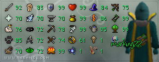


 I like the text; since I used it in my stat sigantures. Evanescent right?