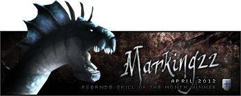
I think it's a little plain as well. What I'd actually suggest is that you re-shift the focus to his eyes, rather than his nose and lower jaw. The bright patch over his mouth just doesn't do it for me. And text, yes, I'm very nitpicky about text. I do not like text that is slanted and stuck somewhere hardly visible. Text should never be "just a label," it should work as part of your sig. In this case, I'd completely re-do the text. Maybe find a good font, stick the batman logo back there..it's up to you. It's just a little pet peeve of mine when I see signatures that look like someone just put 12 pt Arial on them.
Wow, that was a heavy crit. O.o I hope I didn't come off as rude, because I really do think it could look better. Anyway, the fact that you did a version two shows that you're willing to go back and work on your stuff. I'm lazy and I never do anything like that.

So cheers to you!


 v1
v1 v2
v2


