Nice Signature's For A Begginer I must Say

.
1.( 6/10) It has a not to bad Font, but the render and backround are too quick. The render for one is not feathered or blended once or ever. The backround is too plain I guess. The border is pretty basic, but basic is good, I personaly am stuck on inner glow's...
2. ( 7/10) Not bad, the render is blended, but over blured. The backround I seem to like, but the 1 pixel border's get old quick. It is a bit over blured also.
3. ( 6/10 )Grunge seem's to not be a good way to bring out anime, and you need a border. The text is not a good thing to see as sexy

4. ( 6/10 ) Not a bad backround... Where is the render? Need a new Text and a new border...
5. ( 8/10 ) Like I like, but the render needs to be blended and a new border.. The text fit's the Sig.
6. ( 6/10 )Ok first of all the border, render and text. You have no problem with backrounds I can see. But you should take some tutorials on the blending and custom text.
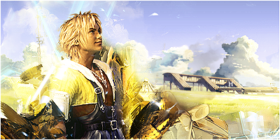
7. ( 8.5/10) Inverted color, oringinal I have to say. This is what a 1 pixel border should be used on, the render would fit perfectly if it was feathered, and the text is not to bad, but it has something wrong with it that I cannot think of off of the top of my head. Maybe a shadow...


![[64]](http://i45.photobucket.com/albums/f93/Harkaan/StartrekEnterprisetag.png)
![[178]](http://i45.photobucket.com/albums/f93/Harkaan/Linksigcopy.png)
![[64]](http://design.rsbandb.com/SOTW/WinnersSig/harkaanweek64.gif)
![[178]](http://design.rsbandb.com/SOTW/WinnersSig/Harkaan_week178.png)