Post new topic This topic is locked, you cannot edit posts or make further replies.  [ 9 posts ] 
Author Message
 Post subject: New look of the Runescape website. (Actual Site)
PostPosted: November 21st, 2011, 5:52 pm 
Rsbandb Donor
Offline

Joined: August 24th, 2008, 3:04 pm
Posts: 1088
Location: Rhode Island us
RS Name: Killjoy4eva
RS Status: Old School (2007)
Logo:
Image

Site:
Spoiler for Medium Sized Images.:

Image

Image

Image


Quote:
RuneScape developer Jagex has unveiled a brand new website and logo for its popular free-to-play online role-playing game.
Launching tomorrow, the redesigned website will sport a brand new look, as well as an array of new tools and features.
New features include a brand new community-editable RuneScape wiki, which will be available for all players to edit and add to.
Meanwhile, an events section will be devoted to organizing and advertising events, which will enable users to "put up details on the events feed and place a location pin into the events map to direct prospective attendees".
Finally, news, media and social activity feeds will be moved to the new front page, ensuring that "up-to-the-minute RuneScape information is readily available at all times".

_________________
Image


Top
 Profile  
 
 Post subject: Register and login to get these in-post ads to disappear
PostPosted: November 21st, 2011, 5:52 pm 
Rsbandb Donor

Joined: September 9th, 2004, 1:47am
Posts: 9047
Location: In your web browserz


Top
  
 
 Post subject: Re: New look of the Runescape website. (Actual Site)
PostPosted: November 21st, 2011, 8:11 pm 
Black Member
Offline

Joined: August 22nd, 2008, 12:26 pm
Posts: 62
Location: USA us
RS Name: drndog
RS Status: F2P
I love how all of the pictures of warriors and such look nothing like they do in the game.

_________________
Image


Top
 Profile  
 
 Post subject: Re: New look of the Runescape website. (Actual Site)
PostPosted: November 22nd, 2011, 1:13 am 
Moderator
Offline

Joined: February 22nd, 2005, 6:49 pm
Posts: 6927
Location: somewhere over the rainbow us
RS Name: j1j2j3
RS Status: P2P
iono... seems very diablo style

_________________
Image
Image


Top
 Profile  
 
 Post subject: Re: New look of the Runescape website. (Actual Site)
PostPosted: November 22nd, 2011, 9:53 am 
Dragon Member
Offline

Joined: July 12th, 2006, 8:32 pm
Posts: 2570
Location: Gotham City ca
RS Status: Old School (2007)
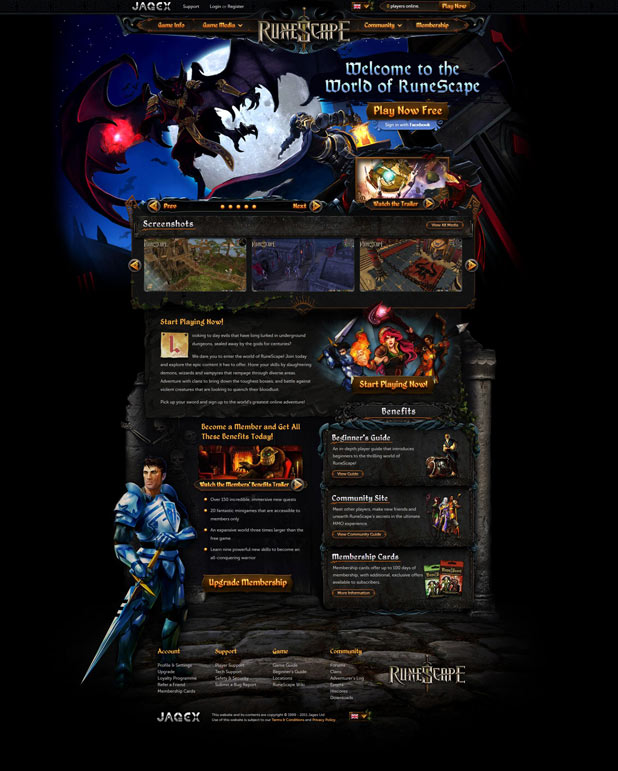
Frankly, it's beautiful. But, it looks like ''just another MMORPG''. Runescape WAS cool because of its simplicity
I miss the old design from 2005. I liked when RS was a simple game. I liked the nooby graphics. I liked the old design of the items such as: Scimmy, Whip, Daggers, etc.

That's one of the reason I will never return: It's like I've been sleeping for 100 years and I woke up in the future. It got too complicated for me lol. Despite the beautiful new home page, the oldest ones had something special: CREATE ACCOUNT giant button, and next to it LOG IN giant button right in your sight.
I liked when the page looked like that:
Spoiler for huge:

Image


As F2P, 17 was my default world, when I turned to members, it became 18. But those eventually became always full so I switched for something else that I don't remember (123 I think).
G.E. was a bad thing because one of the badass aspect of RS was that if you wanted to sell something...you had to TRY to go to W2, with all those noobs in Fally park. (Since trading is back, is it like that again? tell me)
Or W1 with noobs at Varrock bank. Yeah I miss that a bit.

Again, good design, good home page, very impressive. But looks like ''just another MMORPG among many others''. I miss the characters with black lines as their eyes. Yeh.

_________________
It ain't about how hard you hit. It's about how hard you can get hit and keep moving forward; how much you can take and keep moving forward.
Image


Last edited by Iron Maiden on November 22nd, 2011, 5:33 pm, edited 2 times in total.

Top
 Profile  
 
 Post subject: Re: New look of the Runescape website. (Actual Site)
PostPosted: November 22nd, 2011, 12:46 pm 
Moderator
Offline

Joined: February 22nd, 2005, 6:49 pm
Posts: 6927
Location: somewhere over the rainbow us
RS Name: j1j2j3
RS Status: P2P
the homepage seems a little bit of information overload.

_________________
Image
Image


Top
 Profile  
 
 Post subject: Re: New look of the Runescape website. (Actual Site)
PostPosted: November 22nd, 2011, 1:34 pm 
Rsbandb Donor
Offline

Joined: October 13th, 2010, 5:55 am
Posts: 68 za
RS Name: Biscuit
RS Status: P2P
They've messed up the game client on Google Chrome/Firefox if you happen to have a small screen like me, which forces me to use their Runescape client -.-

_________________
Image


Top
 Profile  
 
 Post subject: Register and login to get these in-post ads to disappear
PostPosted: November 22nd, 2011, 1:34 pm 
Rsbandb Donor

Joined: September 9th, 2004, 1:47am
Posts: 9047
Location: In your web browserz


Top
  
 
 Post subject: Re: New look of the Runescape website. (Actual Site)
PostPosted: November 23rd, 2011, 11:32 am 
Rsbandb Donor
Offline

Joined: October 13th, 2005, 9:18 pm
Posts: 3367
Location: USA us
RS Name: Duke Juker
RS Status: P2P
Clan Name: Clan Quest
Looks alright. It'll take some time to get used to, but overall it looked nice. At least it's something new to look at for the three or so seconds I'm on it.

_________________
Image
RSBANDBInformer! Gaming Writer: 08/31/2011-09/30/15
RSBandB Donor since 07/01/2010
82nd Dragon Member since 05/12/2010
RSBandB Member #517
Current Activities: Ports, Dailies/Monthlies, DXP
Skill Masteries: Firemaking, Cooking, Woodcutting, Fletching, Mining, Agility, Prayer, Smithing, Fishing, Summoning, Construction, Herblore, Hunter, Thieving, Crafting, Divination, Dungeoneering, Farming, Runecrafting, Slayer, Magic, Ranged, Defence, Constitution, Attack, Strength, Invention & 1st Max (3/9/19), Archaeology & 2nd Max (4/16/21), 200m Firemaking, Necromancy


Top
 Profile  
 
 Post subject: Re: New look of the Runescape website. (Actual Site)
PostPosted: November 24th, 2011, 3:05 am 
Rsbandb Donor
Offline

Joined: November 4th, 2010, 4:23 am
Posts: 167
Location: Ohio, U.S. us
RS Name: TheLion
RS Status: P2P
Generally I don't use the website except for the "play now" button. For my runescape news, I rely on their RSS feed. I doubt if I will refer much to the new wiki, I'll probably just keep using the Runescape wikia site.

Why did the once again change the look of the hi-scores page? Now it's pretty much messed up. With the skill icons on the right instead of the left of the screen, and with the icons being so large, you can't get a nice compact view of your hi-scores. The original hi-scores worked great, why can't they just keep it simple on somethings?

Thank goodness the "hi-scores lite" page is still available, so I can at least keep importing my hi-score data into excel to track my stats.


Last edited by thelion777 on November 25th, 2011, 7:25 am, edited 1 time in total.

Top
 Profile  
 
 Post subject: Re: New look of the Runescape website. (Actual Site)
PostPosted: November 24th, 2011, 1:41 pm 
Dragon Member
User avatar
Offline

Joined: November 25th, 2005, 6:49 pm
Posts: 1034
Location: California us
RS Name: Sky Jace
RS Status: P2P
There is way too much information on the main page now. Also I don't like how the search boxes for the GE/hiscores are now tiny. Overall it looks prettier, but more cluttered.

_________________
Image
Image
Dragon Member #90


Top
 Profile  
 
Display posts from previous:  Sort by  

You cannot post new topics in this forum
You cannot reply to topics in this forum
You cannot edit your posts in this forum
You cannot delete your posts in this forum

Jump to:  
cron