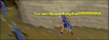
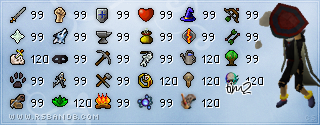
#1 is pretty basic, I probably wouldn't even call it a signature. It's more like a yellow line going through the whole screen with a few bits of text here and there.
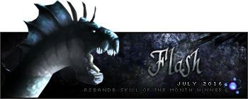
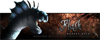
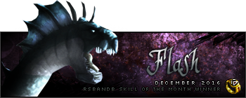
#2 is better than #1, but the opacity on the render is WAY too low, you can't even see it that well. I think it's a dragon, but I can't tell. Lower the opacity on the render and then we might be able to see a real sig.

#3 is another genuine Humus signature. Not much to say than the fact that it's excellent and that it blew my signature out of the water.
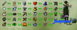
#4 is my sig, isn't it? I'll let you guys critic my signature.

But one thing I want to say about it is the fact that I shouldn't have done the overlay border, it would look a lot better with a real colored border.
#5 is a great signature. The lighting on it is fantastic. It'll probably be him who wins, due to the fact as he is the current leader in RSBandB's SOTW Wins, but hey, it's a good challenge.

#6 is pretty good, I would have made the signature less small and fill up the space a bit more. It looks really empty. Otherwise it would be really good.
Tough week this week. I'm going to debate on who to vote on for a little while. I'll edit my post when I voted.
Good luck, everyone!


