 
|
Page 1 of 1 |
[ 4 posts ] |
|
| Author | Message | |||||
|---|---|---|---|---|---|---|
| Litis |
|
|||||
|
|
|||||
| Top |


| Adbot |
|
||||
|
|
||||
| Top |
| Daniel |
|
||||||
|
|
||||||
| Top |


| Swarmsnapper |
|
||||
|
|
|
||||
| Top |
| Mushroom Queen |
|
|||||
|
|
|||||
| Top |


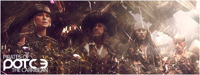
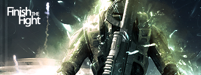
 Lol anyway..here we have a light grey render and blocky white text with a black stroke. Needless to say, the first thing I see is the text and not the image. For now, the only thing I can suggest is you use a light grey fill instead of white and a dark grey outline. The background is nothing special, just brushes.
|
|
Forum Index » Off-Topic » Non-RuneScape Discussion » Graphics Central » My slightly grunge sig :P | Page 1 of 1 [ 4 posts ] |
| You cannot post new topics in this forum You cannot reply to topics in this forum You cannot edit your posts in this forum You cannot delete your posts in this forum |