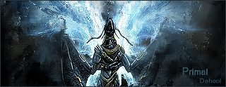
Looks good in general, have some tips though:
- blend the render more into the bg (just a little bit, not too much). The way I usually use to make this work is make a copy of the render, make it 30-40 motion blur, and set it to overlay/soft light depending on the general brightness of the sig. You might also want to make a few of these render copies and drag them alle around the sig (gives great color blending of render with background)
- Try not to emboss the text of your name that much, instead put it behind the color adjust ment layer and use inner shadow on anywhere from 15-50%
- Try to make the border 1 pix only (but that's just my personal liking

)
Things I like alot:
- Nice render
- Good depth in background
- Good text placing
- I like the abstractness of the bg in general
- Also, nice use of color adjustment (but maybe a little bit less white in bg, don't know for sure)
7/10


