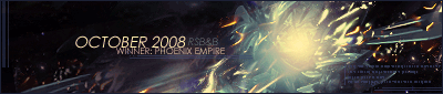
Last week was taken out by PhoenixEmpire, with his magnificent vertical sig:

I still think it sucked compared to mine (obviously), but ah well, here's your trophy. Congratulations!!


Nah actually the more I look at that, the more I frown upon my own.

COMMENTS!
- http://img141.imageshack.us/img141/4865/sonicteamsigce4.png
"Love the Sonic renders, but they (as well as the background) could've been done a little bit better. The crisscrossing lines sort of throw everything off as well. Not a bad job at all though."
- http://i240.photobucket.com/albums/ff14 ... dsurftenvertical.png
I'm not sure if I can give a fair comment for this; some judges liked it, but for me it really doesn't do anything. There were commendations on the blending, but I'm personally not too fussed on it. The bright white doesn't blend well with the other colours used. Overall, the signature's colours are far too saturated also. If I may again quote a judge: "The motion in this sig is great, but the colours are wayyy too saturated."
- http://i164.photobucket.com/albums/u35/abyssalfaction/tainted.png
I can't even read the second line of text on this!  That text and background certainly need to be darkened. Try sprucing up that background a bit too by using brushes to complement the pattern.
- http://img366.imageshack.us/img366/6871/spidermancopybm0.png
Where do I begin? Actually I don't think there's anything to begin with - beautiful!
"By far one of the best signatures I've seen in a while. The colours are vivid and I love the blurred effect around the render. Excellent. If only there were text to accompany it."
- http://img296.imageshack.us/img296/3944 ... hingiwanttoshtu5.png
Why oh why did I sharpen this and what was I thinking adding that border on the right?
- http://i45.photobucket.com/albums/f93/Harkaan/VerticalSigcopy.png
What on earth is that outline around the render?  The render is far too saturated (or at least the face and arm) while the rest of the sig lacks saturation. And it looks like a stray C4D has come out of nowhere and obstructed view of the render. As far as I can see, a very flat sig, and I know you can do better, Harkaan. Others had more fond opinions but made no further comments so unfortunately I can't give any examples.
- http://img377.imageshack.us/img377/4125/mirrorsedgecopyve8.png
Good choice of render, motion and position. Colouring is good - except the red on the text is a bit random - and it seems all that's missing is blending; the render just appears to have been placed on top of the background at the moment. Alternate between erasing and brushing over the edges of the render, particularly the edges of the torso, and you should get some good blending going on there. 
Got distracted talking on MSN about old times and looking at chat logs from early 2007, part way through writing the last comment; sorry if it sounds unfinished, I lost my train of thought. XD


