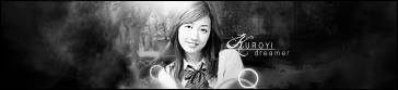
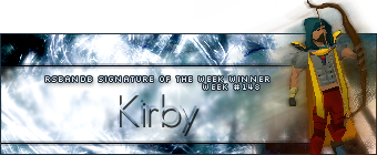
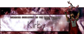
Week 160 was won by Dark Kuroyi with this signature:
Congratulations! Here is your trophy:

Comments are on the way, check back later.
 Here are the comments, We are sorry they are so late. -Jrdgames
Quote:
1. The little cutout portion to the left is unneeded imo. The right side of the render's hair also looks a bit strange, like a piece is falling off or something. I don't know if that came with the render or not.
2. Good sig but you've used this theme a lot and it gets a bit old. Also there could be a bit more color than just blue and white to make it a little less bland.
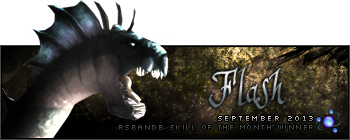
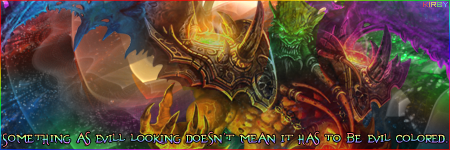
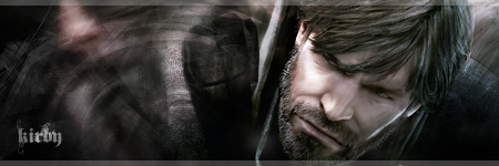
3. The lighting is great, the center of attention is exactly where it should be. Is that a subtle stock in the background? If so it was well placed. Nice sig that holds true to the title of it.
4. The left side is a bit empty when compared to the right, perhaps something could be placed there? Otherwise it's a good sig but there really isn't much to it, just a render and a C4D with some filtering it seems. Also the placement of scanlines seems unneeded.
5. Text needs some work to blend it in better and more readable (especially the name in black in the corner). Otherwise the sig is okay - I like the effect of the large filtered render.
6. A border would help out a bit. Also the colorful brushing to the right doesn't really fit in with the rest of the sig and seems unneeded. More brushing in colors that match the render would make this sig better.
Quote:
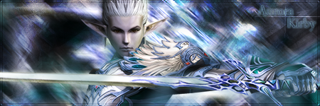
1. This is a good sig and I like the colours in it a lot, but there are a few aspects about it that bother me a bit. The girl's hair looks a little botched, like it was made to look like it was flowing in the wind but the eraser tool stepped in and made it look ragged instead. Not sure I care for the duplication of part of the sig to the left either. All in all though, I think that this sig has great potential and I'd have chosen it if the render were cut out more nicely.
2. This sig is really a nice shade of blue, but unfortunately everything here is blue..the same shade of blue. That makes almost everything in this sig unnoticeable unless you look closely. It'd have been better if this person used different shades of blue on the render and text.
3. Great signature, great background, great render. This sig comes together smoothly and the text is elegant and fitting for the whole theme. I just wish it was a little bigger, but this sig goes to show that size doesn't matter.
4. This is a nice looking sig, but something about it doesn't really appeal to me. The colours on the render are very stark and contrasted, whereas the background has more subdued colours. The result makes it look like the render doesn't fit well with the signature.
5. Love the render, but the background just doesn't fit with the cool cartoon-ness of Luigi. If the background weren't brushed, I'd think that this had a better chance.
6. This is a very colourful signature and the render is striking, but green/yellow/cyan brush marks really don't do it for me. They ruin the flow of the background since the colours don't match the render. I like the font used, though I'd like to see more decoration done with the text.
Quote:
1. I also think the cut-out portion of this sig is unnecessary the hair does look a little strange but it may be blown by a wind. Without the cut-out portion I think this sig would be really good.
2. I didn't notice the animation in this sig until I looked at it for the 3rd time. The animation is smooth and the sig looks good.
3. I don't really care for black and white sigs much because it is hard to see where the signature borders are but this sig looks good, the render fits well with the background and the text.
4. I don't really have much to say about this sig except that the left side looks a little empty.
5. This signature looks like it started with the render flipped and enlarged and then a Gaussian blur and then the render was put on again on the top. This sig would be better if the text was decorated better.
6. This signature looks good, the background could be more advanced but it looks ok how it is now, the text probably could have also been a little better.


 Just some faded colours would help, though.


