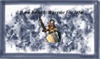
This week was a shocking week - I think this must be the worst sig to ever win an SOTW:
I mean.. despite the fact that that was the entire point.

Congratulations to Rune Beast0!

Just directly included some comments this week. Thanks guys.

Quote:
#4 is just... it's totally definitive of what a horrible signature looks like. ... The others sort of seemed, in my opinion, like they were trying a little TOO hard to be awful. This one is perfectly awful.

Quote:
I'd have to agree with you. The others seem a bit obvious that they were made for an SOTW like this, as no one is either -that- horrible or stupid enough to make sigs like them for actual use. However Rune Beast's sig actually looks like one that someone inexperienced would attempt to make.
Quote:
I wonder why when people see a "worst sig theme" they immediately break out mspaint or an imaging program they aren't familiar with and purposely make something that looks pathetic and think "This looks really bad it has to win."
Oh and I'm sorry it took me forever to get to this - I swear I don't know what happened..