Humus wrote:
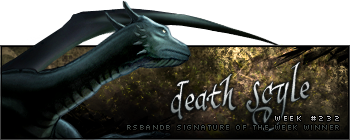
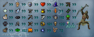
1 is very bland. Border, text and low-opacity render? Not good. 2 wouldn't be so bad if it weren't for the white light, but it just looks like a render with some C4Ds behind it. 3 is too dark and the render has no sort of blending whatsoever. The font is horrible, dunno about you but no amount of love for spiderman would make me want to use it. 4 isn't too bad, but the colours are too saturated, canvas size is waay too big, and the border doesn't work. Just a tip, guys. Don't put text on your signatures unless it REALLY looks good. I've seen so many tags ruined by bad text, and don't put your name on it unless it works, too.
I totally agree with Jay.
Constructive critisms are use to give good and bad things about a work, not only bashing and screaming loud how bad they are. Who are you to say Jay's sig is ''not good''.
A good exemple of critic would be the above posts, who are neutral in their opinion, they don't bring down the author, they give a suggestion to improve instead of free insulting.
Not because YOU are good at making sigs means it gives you the right to bash others. I don't give a **** **** about what you think about my font or my sig. I chose the font because Spidey is my hero plus I wanted to use a font people would reconize and think ''Hey I know that font! It's Maiden's work!''. You have a problem with that? If you want to continue this, PM me, it will be a pleasure to answer, because it's not apropriate right here.
Consider yourself lucky I can't allow myself one more warning because I would tell you the REAL truth.
--
I really like them all. I like the blending on 1, the background on 2 and the font on 4. Together they'd make a perfect signature

. I think I will just randomly vote because I can't decide which one I prefer.
Good job guys


 (reuploaded from


