I voted for number one, overall looks best- especially in black and white.
Don't get me wrong, the others are good too but there's just little things that made me not vote for them.
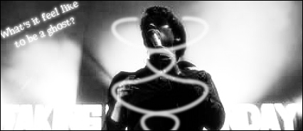
2: Has way too much contrast for my liking. Also the text at the bottom is very difficult to read and takes away from the focal point of the signature. I can make out what appears to be day on the right but the left is just illegible for me. Another thing I didn't like is the white lines in the center, not sure what they were supposed to be.
3: After seeing the color version, the black and white version just doesn't do justice for the signature. The blood splatter is hard to figure out its a blood splatter in the B&W (had I not seen it in color I'd think it was there for no reason). It also looks like you use the same wireframe C4D's repeatedly. They look nice but try some different ones, there's lots more that you can use.

4: Looks awesome but I don't like the scan lines much in this one. I would've held off on them personally.
Overall there were some great entries this week, and Ill hopefully be making signatures again soon so I can start entering. I have to use Gimp though as the computer I have access to can't run PS CS4.
Hopefully my feedback wasn't too harsh, I was trying to give some thoughts for improvement.


