God I'm sorry I'm behind with SOTW stuff again this week.. Yesterday was hectic and so I remembered it at 3am last night.

But without further ado, I can reveal the winning signature of week 173...
Congratulations to its creator, Humus! Here be thy trophy:

My comments:
- http://img405.imageshack.us/img405/5985/abstractwg8.png
I like it, very original and abstracty. But it's lacking, y'know? It's just a background.. there's no text, border or anything. Would be cool to see a more complete version of this.
- http://img527.imageshack.us/img527/2850/halomanip5tz2.png
This is very heavily overcontrasted, first and foremost, which is the primary turn off for me. Difficult to come up with anything else to say since your newer pieces are so brilliant in comparison, but the border is too solid/thick, and the rain doesn't really do it for me either. Sorry I couldn't be of more help with this.
- http://img220.imageshack.us/img220/8976/ffvs1.png
Background is fascinating; looks very complex, but I don't think it works so well in a signature unfortunately. Beautiful aspects but there's no synergy between them. 
- http://img261.imageshack.us/img261/4237/subzerosigcopymh2.png
Once again, you're progressing way too fast for me to give you accurate critique.  This is not a bad signature, I would just recommend using more colour. Try choosing at least one other main colour to use for highlights or shadows along with the main colour which in this case is blue.
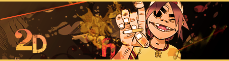
- http://i81.photobucket.com/albums/j220/humus75/art/2Dcopy.png
You really hit the spot with this signature. The 2D feeling is all there, the colours harmonise perfectly. Well done. 
- http://img54.imageshack.us/img54/5734/chaoscopybc9.png
Interesting. I like it, but it's clearly incomplete. I'm not sure what else I could tell you to do with it unfortunately - you're probably more likely to figure out something yourself. 


