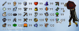
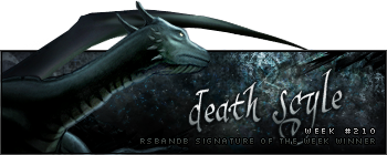
I'm sorry, but it isn't one of your best pieces of work. I think you should lower the opacity of the scanlines on the right, they seem to stand out a bit too much. I'm also not too keen on the overall splatter effect you've used on the background and the render like you said yourself. It makes the render stand out on the sig rather than blending in, although some of the blended parts seem very good, like at the top and on Link's hat.
I do however like the text and the font, however the SyxR is a bit difficult to read, perhaps altering the positioning of the letters would make it clearer.
Just my two cents


