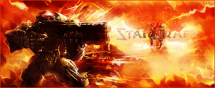
Steven wrote:
Looks pretty good, I like the splatters. I'm just not too fond of the 'darkness' of the signature, it looks waaaay too dark (to me). Otherwise, it's fantastic.
Duke Juker wrote:
I like this picture a lot. The spartan armor always looks pretty cool, and this picture does it even more so. I do agree it's a tad dark and loses a little detail in the splatter effects, but otherwise I really like this signature.

I brightened it just for you guise.
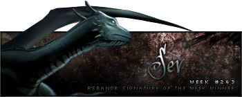
Humus wrote:
Would look 10x better without the border and just a little added contrast. 
It's also just a little bit hard to see what's going on. If I hadn't ever seen or heard about Halo I would probably have a hard job of determining what exactly it is. Not bad though.. just those few points. Yeahhhh I noticed that, too. Made the guy a bit more beastly lookins. Also turned the border on really low, just so its there. Probably should do the contrast although I already has 2 BnC filters on it hissss.
Al3X wrote:
I think the border would look better on a much lower opacity. It's too strong and takes away from the signature.
I also feel like I'm looking through a cataract because the focal looks quite blurry. Maybe apply a sharpen or too. You could also try Filter > Render > Lighting, then set the mode to omni and move the lighting over the focal.
Thats what she said.
Edit: Now its awesome.


