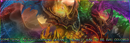
You've got lots of colours in this signature and I think that's one of it's main weaknesses. The others being your background is very sharp with high contrast and you've tried too hard on your text, it looks complicated and messy.
With colours, try to make asignature based on a few similar ones, rather than going from blue to red. It's quite hard to mix cold and warm colours together and so starting off by just using warm colours (like reds, oranges, browns, etc) or just the cold ones (blues, greens, purples, etc.).
Your background has a few distinct problems and it's very common with new users of photoshop so don't feel intimidated. Instead of using the default brushes and using a plethora of effects for your background, download some nice brushes from
here (just choose some you think you'll like) and they'll help to improve your background making skillz.
Text, it should be simple. You don't need complicated text effects like bevel/emboss. It's very good to experiment and the like but that's something I would suggest you prevent yourself from doing as soon as possible. A few effects I've always liked to use is to set the font layer to overlay or soft light and give a simple white or black stroke. The actual font is vital to this effect and you can also find some more at deviantart right
here.
That's all I've got to say on your signature. Keep practicing and you'll improve very quickly. ^_^


