Flash wrote:
Exorcist956 wrote:
Actually, it's not. The only hard part is the tech brushes. You have to know where to put it and everything.
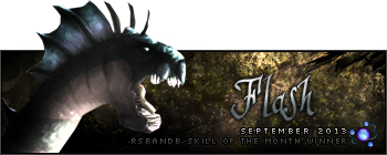
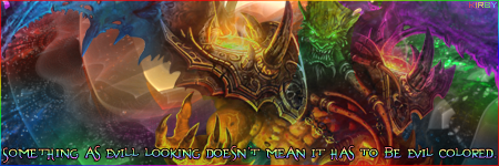
I made an improvement on the sig. I actually think this is better. Only 20 minutes! LOL!

Whoa that's very quick! I thought that it was hard to make but I guess it wasn't that hard after all.
The background looks like the hardest part. The tech-writing seems to be from some website that could be easily found and shrunk if needed. The renders seems to be on lumonosity and the text fits in quite well. I'm not a fan of all one colour, but it looks pretty good for a tech siggy. The only thing that bothers me is the visitor text fading out and in. It just doesn't really flow with it that well.


