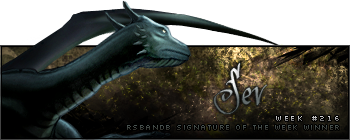
Just my opinion, but matching avatars and sigs just don't look good if the avatar is a copy/pasted selection of the signature in 120x120 form. It's just not that great seeing two of the same thing.

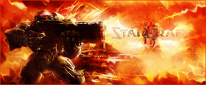
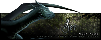
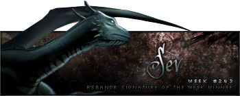
Anyway, my con/crit on this.. Some parts of the background look pixelated, almost like the picture was sharpened after you made it. You can sort of see what I mean in the curves. And yeah, the text. 90% of the time, you should avoid using bevel+emboss on your text. There are very few situations that makes it look good. Instead, try experimenting with the outer glow by adding gradient and changing the mode from Screen to something else.


