Anubis wrote:
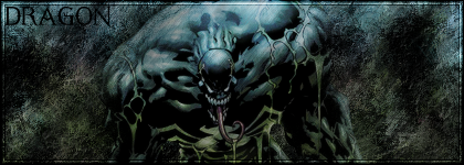
The border is really bad, no offence, but bevel/emboss is a tool which makes anything look like an amateurs' work.
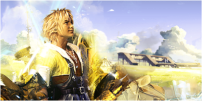
The render should never be placed over the border. The border defines the end of the signature. If something is to be put over the border, and causes the border to be unseen in places, it defies the point in having one.
The text, it needs anti-alias and the stroke is far too big, the text effect is okay, but you need to work on it.
The renders don't really match the background, work on blending them a bit more. Simply placing one on a background requires no skill, your sig would have looked better without them.
However, the better side of your sigs are the backgrounds, they're quite well done. I'm no fan of abstract, but you made the first look rather good.
A rating? 3/10
~Anubis
thanks anubis, the border and render... i didnt think puting the border over the render would look verygood, but is it ok to do that? and i wish someone would make a tut on blender with pics.


![[64]](http://i45.photobucket.com/albums/f93/Harkaan/StartrekEnterprisetag.png)
![[178]](http://i45.photobucket.com/albums/f93/Harkaan/Linksigcopy.png)
![[64]](http://design.rsbandb.com/SOTW/WinnersSig/harkaanweek64.gif)
![[178]](http://design.rsbandb.com/SOTW/WinnersSig/Harkaan_week178.png)