Anubis wrote:
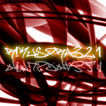
I think you might need to render at a higher quality and stop with the text on top of the fractal.
Theres a splotch at the bottom left corner which looks, forgive me, disgusting, like someone has smeared dog poo on it.
I'm not too sure about the gradient, looking at your past work I'm led to believe you didnt pay much attention to the colours created in apophysis and simply added them in photoshop. In my opinion, that ruins the fractal.
Text on top of it, again, I think it ruins it. Why? When you can easily create a border and make it look more professional? Its almost like putting in big green letters "forest" on a photograph of a tree. Instead of creating a border like almost all photographers do, and adding the title in there.
This time, instead of disregarding what I have to say, take it to heart. You WONT get better by listening only to the people who say "wow thats cool", or "rafe u rool". Take a look at other fractal artists works, and look at what they do. Then realise that what you are doing is completely different.
OK I'll start at the bottom. Where have I ever done this? Show me a full example of this and I will apologize.
Why can't I put text on top of it?
Why do I have to do a border?
What do you mean by again?
AND THIS ISN'T FREAKING PHOTOGRAPHY.
This WAS IN FACT the gradient. Color balance is applied, but that is just to touch it up, it doesn't change the freaking gradient.
I see no "poo" spot. Please enlighten me.
Please do not wake up on the wrong side of the bed in the future.