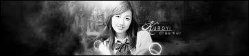
1. Gorgeous. I like how smooth everything is, along with the subtle colours you used. The render and background literally melt into each other and that "heavenly" look is really fitting.

The text isn't a good colour though. Making text isn't always easy though, but one thing I live by is that your text should always stand out, but fit in. Sometimes that's hard to do, but I think you should change the colour to something that has a little more pop.
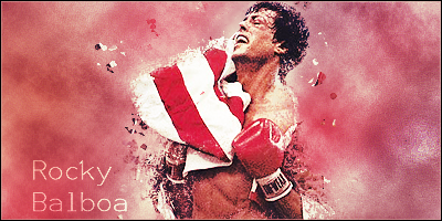
2. I would've liked to see a sharper background with maybe some sparks and such, but this one isn't bad. I love the yellow and purple colouring as well. The only thing that bothers me is the over simplicity of the text. A different font colour might be better too.
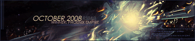
3. I thought of comic books too when I looked at this! It actually reminds me of the comic art of Matt Camp (he uses more subtle colours though). Again, the text bugs me. I think a different non-techy style should be used.
I think you should add a 2px border to your signatures. The outer border can be black (for use on white forums), but the inner one should be non-black. What I do is: I make my outer borders black, for said reason. Then, I create a new layer. I make the inner border either white (or some other light colour that matches), then set the layer style to Overlay or whatever looks nice. This gives the signature more versatility.
Great job on them all though. They're all very unique and show that you can do multiple types of styles.


