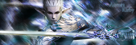
Neo 9001 wrote:
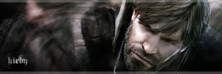
I don't know much at all about the GIMP (I myself use photoshop), but looks like a nice outcome for a first attempt =)
I would suggest that, to improve your skills, just practice more, follow lots of different tutorials and so on. Don't be afraid to experiment with render position also - moving your point of interest to the side or whatever can make your sig more appealing. For example, on your sig, I would be tempted to move the render to the right hand side and up a bit, so that the top of his hair can't be seen (not that I think his hair is ugly, I'm just saying where I think it may look better ^^)
That's alright, feel free to speak your mind. Thanks for the advice.


