May I suggest some things to help you out?
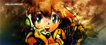
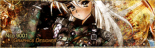
1) Make a border, most peices of work (sigs, fractals, paintings) need one, even if its a 2 px one it makes a lot of difference. try not to make it black though, since it wont be visible.

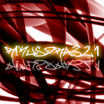
2) Work on your backgrounds, its hard to critisize backgrounds because, well, they dont really have a generic look. Sigs on the other hand, do. Most people nowadays like grunge, pixel stretch or abstract backgrounds, download some brushes and experiment. textures also come in handy when making backgrounds.
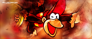
3) Your render doesnt need to be exactly like you found it. What I used to do with sigs is find a render, then feather around it afew times gradually decreasing the amount. Sometimes it worked, sometimes it didnt. Again, experiments are a good way to learn.
4) Text, you've done quite well with this I do think. With exception to your name at the bottom. When adding your name, I'd suggest a pixel font at size 8, hidden in the corner somewhere
of course, I gave up sig making a while ago, so what I did may not give you what is good now.But its a good start


