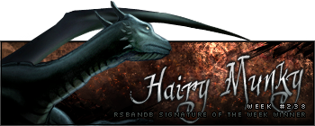
#1 is okay... It's not exactly SOTW Win worthy, but it's okay. I'd suggest trying to put some more things on there, such as a background that matches the render. Taking a render and putting it on a black background is really not appealing.
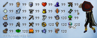
#2 is really good Munky, but the one thing that bugs me about it is the choppiness of the render. It's really not that good of a render. Another thing that bothers me is the eraser stroke through his hand. I wouldn't be able to tell it was there if it wasn't for the outline of his fist that was there, lol. Also, the C4D that's going around his sword is pretty well placed. PS: Did you erase part of the blade or is it like a really small knife or something? xD Really well done, though.
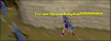
#3 Is my sig, and I don't want to praise myself or look like I like it the most, so I'll let you guys judge it.

#4 Pretty good, Sev. I like it, and it looks really good, but it looks to small in my opinion. Perhaps had you made it bigger, it'd be better.

Not much to say about it as it's already been spoken about a lot in Graphics Central. <3


