Hey everyooone,
I didn't forget about the theme suggestions you guys sent me a little while ago, so here's one of them to kick off the next few member-themes weeks...
 Text!
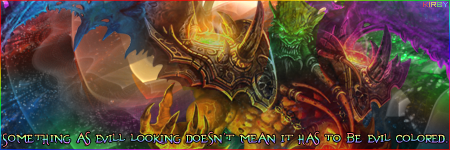
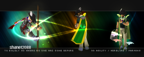
Text!The worst enemy of the vast majority of designers, while text should be used to your advantage and you should not fear it. So embracing that fact, this week your signatures must have text as the obvious focal point. Renders may be used, and stocks and stuff, whatever else you want really, as long as the text is clearly made to be looked at first.
If you need clarification on whether your signature would be deemed appropriate then feel free to flick a PM to any judge and we'll let you know.
I hope that's understandable, so good luuuck, have fuuun. Don't forget to read the ruuuules.

I'll stop now.
Edit: Almost forgot to mention, this theme was suggested by PhoenixEmpire. Thank you my dear PhoenixEmpire.


