|
Chief Snake
|
Post subject: Week 176 Winner  Posted: Posted: November 4th, 2008, 3:46 am |
|
Joined: October 25th, 2004, 10:12 pm
Posts: 3055
Location: New Zealand

RS Name: Chief. Snake
RS Status: Retired
Clan Name: Bits and Bytes
|
|
Winning week 176 was none other than kimpen with this signature... 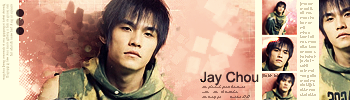 Congratulations! Here's your trophy:  Judges' Comments: - http://img234.imageshack.us/img234/1682/slurrednbfb0.png
I like this. Beautiful colour and awesome blending. Whatever effects you put on this are unique and they work very well. I can see why you didn't add a border or text; neither seem like they would fit very well in any form. Overall certainly a commendable and magnificent sig, but it needs something more I think. It looks really brilliant, but it just doesn't really catch my eye.
- http://img521.imageshack.us/img521/7470 ... rchiefsigcopyji4.png
First of all, no need for the scanlines in the background. Get some blending done around the edges of that render: brush all around it and make it look a part of it, don't just have it sitting there on top of everything. After that you can make a new layer, apply image, get out the burn tool (alternating with the dodge tool if you want for highlights) and start adding shadows. Easy stuff really. I like the text; font is perfect as far as I'm concerned and the simplicity of it matches the feel of the sig very nicely. This might change after the background is fixed up but you'll be able to re-evaluate it then.
- http://i464.photobucket.com/albums/rr4/ ... he-last-reverent.png
Hmm. I don't really like this. The background, as always, is quite nice - particularly the left side of this one - but the render ruins it. Must be mainly the fact that the face of it is zoomed as part of the background also, which just doesn't look right. There's not a lot of colour in the render, which clashes with the bright, highly saturated background. It's also a bit fuzzy and quite honestly just plain too small. Something my grandmother (who is an artist) told me is that you should never put anything directly in the centre of a piece of art (unless you really know what you're doing, I suppose). Ok, your render is not dead in the centre, but it looks lost. Because it is so small, its positioning just looks completely random and I have no idea what it's doing there. In conclusion, bigger render, make it stand out against the background (using shadows/highlights and use of colour) BUT still blend it in like you've done now (brushing edges etc).
- http://i45.photobucket.com/albums/f93/Harkaan/Misacampocopy-1.png
Now this is nice. I don't really have much to say about it though. Text is a bit random; doesn't fit. Apart from that, awesome. Nice work.
- http://i240.photobucket.com/albums/ff14/kimp3n/JayChousigje.png
I think I first fell for the colours and blending in this sig, then its composition sold it. Just little things like increased sharpness without overdoing it... A truly professional sig. Well done.
- http://i354.photobucket.com/albums/r416 ... rangegreen-1-1-1.png
The silhouette concept is a good idea to start with, but I have no idea what that background is supposed to be! Clashing, very web 1.0, solid colours. Assuming you use Photoshop (or GIMP), you should try using some brushes from http://www.deviantart.com.
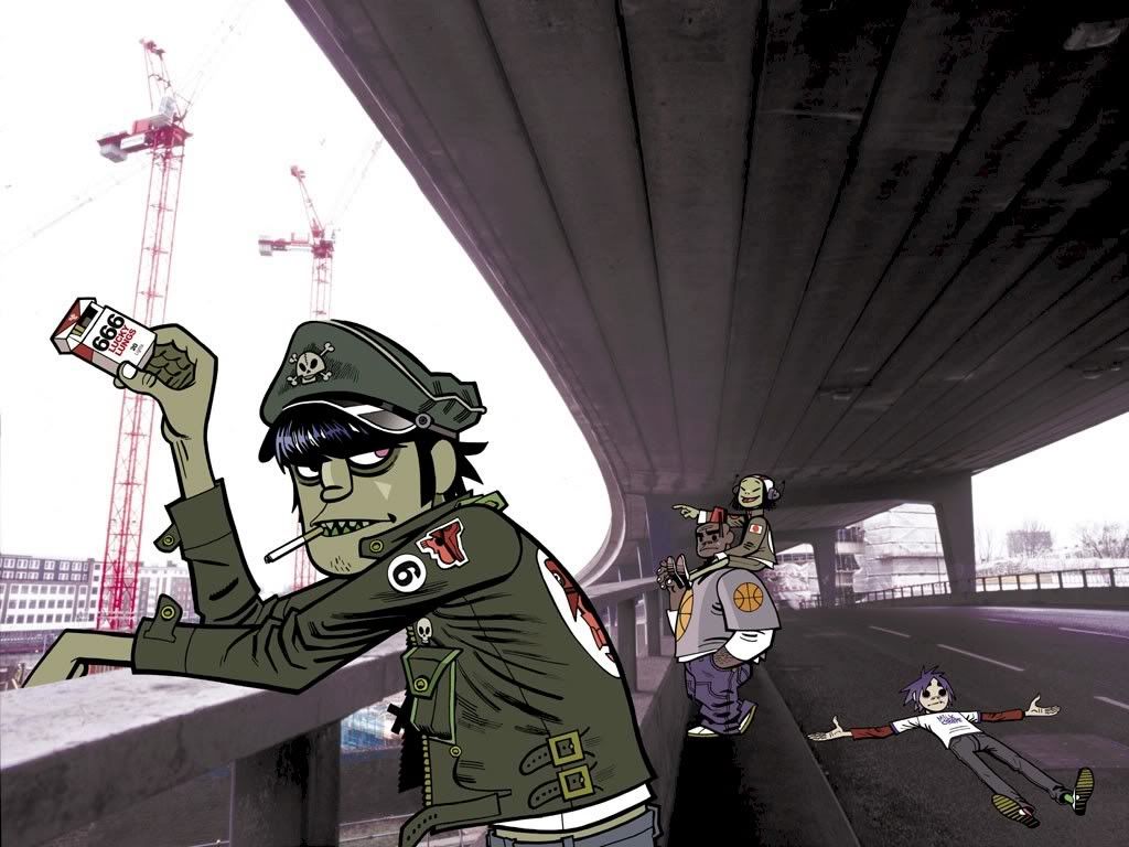
- http://i81.photobucket.com/albums/j220/humus75/art/murdoccopy.png
I wasn't personally too fond of this sig initially, and after seeing the original image used, I made up my mind. About the only thing I do like in this sig is the colour change from grey/green to brown - an intelligent choice - and the rest of it is just poor photo manipulation on something that isn't even a photo. Choppy sharpness and blurring in some places. The desaturation doesn't do it for me and neither do the little spots on the right, blurred side. Actually I lied before about the colour being the only thing I liked; the border does work and the text fits, but don't overdo the repeated background that you have under the text, also similarly used for the border.
Sorry this is particularly harsh - critique is my own, but I do know for a fact that other people definitely do like this sig. 
- http://i79.photobucket.com/albums/j146/tjbartz/Wham.png
Colour clashing really gets me here - the blues and whites of the render against a completely different, dark green background. Blues all 'round would be nice, so just recolour the background. Secondly as I believe someone else pointed out, the slant of the sig background? Looks unrealistic and simple rotation would have been preferable. Because of its slant, the text positioning doesn't work; it aligns with the top edge but not with the right edge. Apart from all that stuff though, the actual popout effect of the sig is effective, to me, and has been executed well.
_________________
|
|


