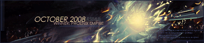
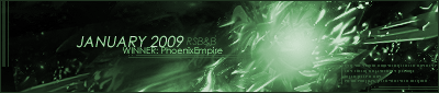
PhoenixEmpire was the victor of week 167 with this sig:

Congratulations! Here is your trophy...

Judges' Comments were quite vague this week but I thought I'd include what was posted anyway so they wouldn't go to waste.

Quote:
I'm gonna have to go with 6 this week. The whole thing just looks by far the most professionally done, and the blending brings a tear to my eye. He could have played some more with lighting but overall it's still the best.
Next in line for me was 2. The text slots in perfectly which is something you don't see very often nowadays, and the background is brilliant, but there is no lighting or blending of the render at all. Humus needs to become familiar with using the burn/dodge tools, adjusting the brightness/contrast, and he is at the stage where he need not be afraid to brush over at least the edges of the render occasionally. This sig has so much potential so I was disappointed that he didn't change anything of it before he entered it.
Quote:
Definitely #6, no questions asked. It's just a beautiful piece, the blending, the lighting and the text just melt together. I will be very surprised, and a bit disappointed if this doesn't win.
Next in line was #4. For me it was the closest competition to #6. The colour blends in with this sig quite well, but could use a bit more lighting.
Quote:
I found this to be actually a pretty tough week. :p
I'm also going with 6. The blending, like ---- said, is beautiful, and it just flows together so nicely. I think number 1 came in second, I just like how the background fits the render and the text is well done.
Quote:
It might just be me and my preferences but I think the lot of them have contrast problems this week. Some are too low, some too high. Nonetheless I was struggling to choose between 3 and 6. Number six has far too much brightness for my liking but three seems very generic and doesn't blend as well; the shadows on the face do not match with the shadows in the background. I'll be voting number 6 also.


