Winning their 7th SOTW title with a fantastic signature is... PhoenixEmpire!
Congratulations on your 7th win!
Quote:
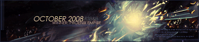
Here is your trophy;
Quote:
Quite a nice one if I do say so myself.
Judges comments are as follows:
#1
To me this just seems like a background, like its missing a render. I would suit a couple more colours too.
#2
I like the sepia tone thats overlayed onto it. Although the background is slightly to sepia to match the render. The border fits, its odd but a nice touch

. Not sure about the grayscaled box behind the text or 'your' being on two lines.
#3
This to me looks like it took about a minuite. A render, some brush patterns. It isnt a bad effect they've got going but its not enough and the text is poor.
#4
I cant tell what the render is but it looks good. The lighting is superb. The signature matches seemlessly. Theres a strange white dot floating but other than that and maybe some text it is a good signature.
#5
There is some good effects in this signature and i like the way the render blends into the background. Other than the left side it looks as though nothing has been done except a filter. The text is only half visible too.
I announced this week because Chief is fat.


