Wowee. Week 174 was a splendid week indeed. But our winning signature...
Félicitations encore to Dark Kuroyi! It's like she wins every week she enters?!


As if any of you really need them anymore, makes my job easier yet I still spend almost an hour writing them... Judges' Comments!
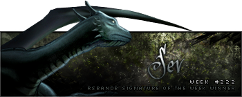
- http://img215.imageshack.us/img215/6645/carmine2il5.png
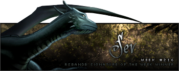
Well done Sev, as I said in GC I was very impressed by this and it's a huge step up from your other work. All I can really say is to keep experimenting, and your newer sigs are reflecting this already - just remember not to limit your sigs to single colour schemes (this one is pretty good as it still includes the colours from the original render). The white top and bottom translucent borders are alright, nothing special but they do seem to fit the sig so I'll let you off on them. All that needs a bit of work now is text.
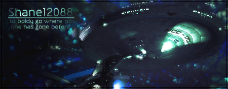
- http://img123.imageshack.us/img123/91/starshipcopyaw2.png
I think similarly to what I said to Harkaan a few weeks ago, this is another quality PhoenixEmpire sig! It just doesn't really jump out at me. Make it bigger - wider to be more exact - and create a strong focal point using light.
- http://img508.imageshack.us/img508/2613/gow2skorgesigcopyqr0.png
I love this; it got my vote almost purely based on its text.  Cool background, nice blending, all I'd really like to see is some more colour dynamics - get out that burn tool and go crazy! Well almost. Crazy within reason and as long as you don't overcontrast anything. One minor note is to be careful with the fine details, in this case your border. There is a 1px high gap of free space at the top of the sig, but a 2px high gap at the bottom. To fix this all you'd have to do is crop 1px off the bottom.
- http://i240.photobucket.com/albums/ff14/kimp3n/whitetigersig.png
This was another of my favourites and I couldn't get over the amazing use of colour. I even forgave you for using that terrible font I can't remember the name of. Tiger needs to be blended a bit more, but that's really all I can come up with.
- http://img385.imageshack.us/img385/1719 ... lintheskycopyde0.png
First thing I notice is that the render is terrible quality (it's all Jpeggy); where did you get it?? Anyway, I like how you put focus on the render by lightening the background behind it, and the background looks pretty good. Just steer clear of using cliché patterns like that wherever possible (I'm assuming that's a texture/pattern?). Obviously the text needs some work, but as usual I just suggest getting everything else looking good since text is the hard part.
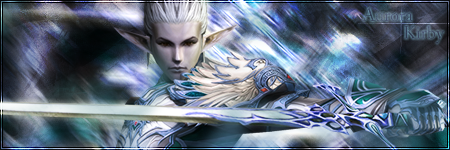
- http://i233.photobucket.com/albums/ee57/Kirbyimg/monksig.png
Once again I'm impressed: text and background are stunning, I was just so disappointed that the render didn't seem to fit in too well. I know the background looks fantastic and you probably are keen to show that off, but make the render just a little bigger, brush around it, behind it and over some of its edges to blend it in. There is no light source, so to make your job easier, after you've done that, "apply image" on a new topmost layer and render lighting effects to it (as you'll be familiar with from the clan banner tutorial).
Text = PERFECT
- http://i224.photobucket.com/albums/dd140/Dark_Kuroyi/Gunz.png
Flawless.


