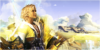
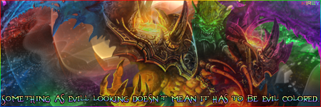
Once again Dark Kuroyi reigns this week with this sig:

Congratulations! Enjoy your trophy...

Judges weren't too keen to comment this week since there were so many signatures, but there were a few, so I'll add my own with them.
We say...
- http://img180.imageshack.us/img180/7025/testbo6.jpg
I like this and it got my vote. I love the old-style photo-manip look and the colours worked very well with it.
- http://img363.imageshack.us/img363/4051 ... toabstractcopqr3.png
Eye-catching, unique, grungy and flowing! This was another one in the running for winner.
- http://i81.photobucket.com/albums/j220/ ... t/stockkidv2copy.png
Again an impressive sig. To improve I would suggest to erase the parts of the C4D (or whatever that is) that are overlaid onto the render, and to change the border to something a bit more fitting - probably make it brighter, closer to white, rather than a black overlay. It should be said that this looks very contrasty on the left and right side of the render. This is wrong for a start because your light source appears to be from behind, so you should be darkening the face. In any case, try to even out the colours by recolouring the right side of the hoodie. The cyan is alright and is a fairly good contrast against the other colours in the signature, but I think it stands out too much. Try just a darker pink/red.
- http://i45.photobucket.com/albums/f93/Harkaan/Smokefinalcopy.png
Good. Another signature up to the usual Harkaan standard!  Only thing is it doesn't really jump out at us. It's just another one, y'know?
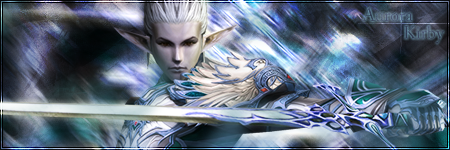
- http://i233.photobucket.com/albums/ee57/Kirbyimg/samurai-elf.png
First of all the colour choice is perfect and the background is great. The border and background work well.
What you need to do is make this a lot smaller - down to about 400x120? Do that alone, and I will probably like it twice as much. Honestly. Next, erase everything that's overlaid on top of the render. When I say "erase", you don't have to be a perfectionist about it, but just use a 30-40px soft eraser with 0% hardness and roughly get rid of everything on top. You can leave some edges to blend them in a bit. Lastly experiment with text, but until then you can remove it altogether. Just get everything else perfect and THEN I give you permission to add text and play around with it until it's right. 
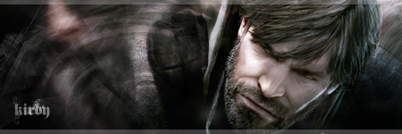
- http://img231.imageshack.us/img231/4306/greatkirbysig2jc2.png
Your week 172 entry is a big improvement on this so I'll give you some comments and a comparison when it comes to next week.
- http://img525.imageshack.us/img525/9819/scratchng0.jpg
Brilliant really; it stands out, it flows, the colouring is amazing, and nothing is overcontrasted - YAY!
The only thing I cannot get over is that the text is bevelled & embossed.  Personally I don't like it which is why this didn't get my vote, but hey, it still won. Good work.
- http://fc69.deviantart.com/fs37/f/2008/ ... y_HopelessSoul13.png
Why are there scanlines all over it?  I can't see anything!


![[64]](http://i45.photobucket.com/albums/f93/Harkaan/StartrekEnterprisetag.png)
![[178]](http://i45.photobucket.com/albums/f93/Harkaan/Linksigcopy.png)
![[64]](http://design.rsbandb.com/SOTW/WinnersSig/harkaanweek64.gif)
![[178]](http://design.rsbandb.com/SOTW/WinnersSig/Harkaan_week178.png)