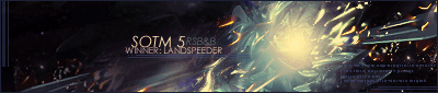
Our own Daniel took out last week's competition with his first win since week 129!  Which makes that his 10th win!  Congratulations.  Judges' Comments: - http://img145.imageshack.us/img145/6984/911copyez4.png
On design terms, the best sig. I like the positioning and size of the "9/11" text but the rest of it could use some work. Good detail, fits the style well, but I'm not sure if the style really suits the theme.
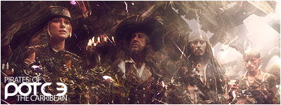
- http://fc05.deviantart.com/fs36/f/2008/ ... y_HopelessSoul13.png
I'm going to call this a Brandt sig. It's got his text, his contrasted "photo-manip" style, and even his left and right off-coloured borders. I actually thought this was one of his sigs when I saw it. There are little things wrong with this signature that bother me but are insignificant and I feel bad about pointing them out so I'm sorry but I just have to. 
First and foremost you must get rid of those bars on the left and right sides. The sig already has black space on the sides which acts similarly to a border.
It needs to have balance. You have black space to the left and right of the sig, but there's more space on the left. Even it out so there's just as much space on the left as on the right.
Ditch the stroke on the text, and the horizontal line between "9/11" and "Never Forget" - in fact, get rid of the "9/11" text too; we know what the sig's about. If you must keep the watermark in the top right corner, make it an unobtrusive pixel font like Silkscreen (anything but Visitor, really) and remove all styling from it. Position it in the corner so that it is the same distance from the top edge as it is from the right edge. With the "Never Forget" text, remove all of its current styling and give it a simple drop shadow. You might want to make the font size a tiny bit smaller and increase its letter spacing. You may need to duplicate this layer once or twice to make it stand out.
Scanlines can stay, but at the moment they're detracting from the sig. Lower their opacity and erase them from on top of the buildings.
I think that's more than enough for a start, so I'll leave it to you now.
- http://img372.imageshack.us/img372/883/911crashtributesigqi4.png
"It is difficult to see the towers in this sig, them being gray on a black background with gray interference in the foreground, honestly I do not even see the other tower. The red and whitish-gray brushwork on the left and right sides of the render do not blend well with the render in my opinion."
However, "the color theme was much more intact (all shades of gray) and appealing to the eyes. It gives the impression of devastation and just that distinct impression that they once existed as though recalled from a memory that was never truly forgotten. The others ... well, I just couldn't really see that in them."
_________________
|


