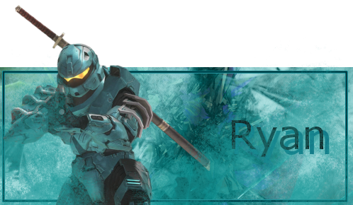
Taking advantage of the new size restrictions, Ryan took out week 159 with this popout sig:
Congratulations on your first win!

The judges were divided in their choices this week, so it would only be fair to post some individual comments.
Quote:
1. It doesnt look like much was done except using filters and such. He put a render onto a stock background if I'm not mistaken. Not much effort put forth from my eyes...
2. Definatly not one of his best signatures. Just something about it that lacks...plus the background doesnt match the render that well.
3. Dont have anything to say except...GMV
Quote:
1. I find this to actually be a good sig because it has a great use of colour and a good background as well.
2. The only problem with this signature is the render not meshing well with the background. The background is great and I even like the border, but the photo just doesn't look good. Maybe if the photo was cropped and reused in a different way it'd work, but at present it looks awkward. I do like the colours a lot though.
3. The render is flat, the border is odd, and the text is a little too amateurish with the rough drop shadow behind it.
Quote:
1. I like the color but as TJ said the background looks a lot like a stock that was recolored.
2. Coloring is good and I like the brushing but the render seems to appear a little out of nowhere. The right shoulder (my left) also looks a bit strangely cut off.
3. I like the popout effect and the brushing - it makes it feel as though the render's coming out of a heavy battle/storm. The only thing I'd say is get rid of the drop shadow on the text, it's unneeded.
#3 for me.