Rainbow week was won with this extremely colourful sig..
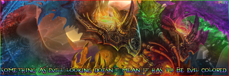
Congratulations to its creator, artist and first time winner, Kirby!


The first of many wins, I hope.

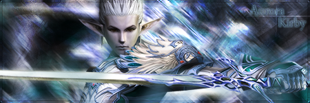
As there were only two signatures entered, and not many comments on them anyway, I don't think it's necessary for me to merge them. I felt these comments did the signatures justice.
Quote:
#1 - Not the greatest looking signature I've seen before. There are a lot of things about the signature that could be improved, such as the solid white border, XBLADES text in the corner, and the failed reflection (at least that's what I think it is). Firstly, in this case I would lower the opacity of the solid white border to around 50% or the same opacity percentage as the flower power text, and I would scrap that rectangle background that is behind the XBLADES text and make the text white with maybe an even lower opacity. For the reflection just lower the opacity to around 15-25% and use a mask and use a fuzzy/gradient-to-transparent circle brush and fade the bottom.
#2 - I think everything flows quite nicely together in this signature. The only thing that is a disappointment in this signature is the awful looking text. I would use... well now that I look at it, it seems to be fine as it is. It looks evil'ish and whatnot. Good work!
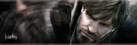
As a personal opinion, the first thing I noticed on Kirby's signature was the text, as it's a huge distraction from what should be the focus of the sig. This could actually be as a result of the text being an entire sentence, rather than the font choice etc. That being said though, I still think it looks plain as far as text goes. The rainbow gradient applied to it looks amateurish and should be swapped out for something more "simple but effective"; possibly change the blend mode to overlay or soft light and play with shadows. Avoid using a stroke wherever possible on small-fonted text with antialiasing.
Secondly, the render needs to stand out more. Increase the contrast on that layer and it should be good to go. Possibly after that you may need to implement some sort of blending technique to make sure, while focus is now firmly on the render due to its increase in contrast, that it still blends in with its background.


