Before I go wallow in my own self-pity, I figured I'd better announce the week's winner...  Who happens to be none other than the judges' very own Mushroom Queen!   See. Told you you'd have competition.  Zie Judges' Comments: - http://img245.imageshack.us/img245/4325/sotw138tg4.png
The squiggly lines in the fractal look interesting and cool, but the text looks like an army type of font that doesn't really fit with the fractal design. I would recommend changing the font of the text to something that fits more well with the design, and try adding some sort of border as well.
- http://xs223.xs.to/xs223/08046/sotwentry5347.jpg
Artistically, a very appealing signature, with the usual brilliant shading, however the transition from black to white on the right side could have been more well thought out - it looks to me like a mistake has been made so you've had to draw over something.  But I dunno. One suggestion was to perhaps try shading a gradient type of effect. But I dunno. One suggestion was to perhaps try shading a gradient type of effect.
- http://llamaslayers.net/daily-llama/wp- ... /rat-7.png
There's a nice painted feel to this signature, and it has good colour, but the grass looks very out-of-place. Add some filters and things to it, and mess with the colour a bit until you can get the entire signature feeling the same.
- http://i233.photobucket.com/albums/ee57 ... nature.png
Very creative! We like the mist and the face on the left side, and the text faded in with the background as well (although maybe a more original font?). You might have added too much glow to the render and made the mist/light a little too bright, which could both be reduced. Well done.
- http://i5.photobucket.com/albums/y172/t ... 55de07.png
Awesome grunge effect and colours, but you only need one render. 
- http://img296.imageshack.us/img296/1231/chalicezu9.png
This sig definitely has potential in terms of its design, but hold up, we can't see much there! Lighten it up a lot more and you'll be sweet. A dark-ish border may be a better choice than the white one too.
- http://img231.imageshack.us/img231/272/sigjedlh6.jpg
Like Burnt Joint's sig above, design-wise this is on the right track, but we can't exactly tell what we're looking at. The colours are great, C4Ds blend well, but the text could use a bit of jazzing up.
- http://i45.photobucket.com/albums/f93/H ... -creed.png
I personally would suggest giving this some more contrast. In this case, the text is very distracting, mainly due to the bar in between the two text positionings, which, while being creative and a nice touch, does not suit this signature. Get rid of the bar and make the text more appealing, and you will have yourself an outstanding sig.
- http://i2.photobucket.com/albums/y21/Si ... copy-1.png
This is almost all one colour  . More colour! Apart from that it's a great sig. . More colour! Apart from that it's a great sig.
- http://img170.imageshack.us/img170/6792/siggah4.png
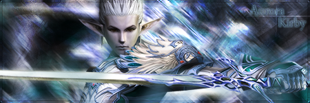
You know what your comments are MQ, so I'll just say for myself, the more I look at this the more complex it seems. I'm not really sure the text fits it so well, but otherwise my only issue would be the sharpness of the edges around the brick wall. To me it was really off-putting since the fire makes it stand out so much. Anyway, a very effective manip once again. 
_________________
|


![[64]](http://i45.photobucket.com/albums/f93/Harkaan/StartrekEnterprisetag.png)
![[178]](http://i45.photobucket.com/albums/f93/Harkaan/Linksigcopy.png)
![[64]](http://design.rsbandb.com/SOTW/WinnersSig/harkaanweek64.gif)
![[178]](http://design.rsbandb.com/SOTW/WinnersSig/Harkaan_week178.png)