|
Adbot
|
Post subject: Register and login to get these in-post ads to disappear  Posted: Posted: July 28th, 2009, 12:18 pm |
|
Joined: September 9th, 2004, 1:47am
Posts: 9047
Location: In your web browserz |
|
|
| Top |
|
|
Humus
|
Post subject: Re: Ice N' Flames Posted: July 28th, 2009, 4:50 pm |
|
Joined: May 27th, 2006, 6:26 am
Posts: 2159
Location: Photoshop

RS Name: Humus_75
RS Status: Classic
Clan Name: Instinct
|
|
|
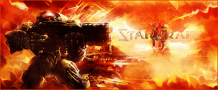
Contrastt!
Just doesn't look good to me. Its way too hard to determine the focal, and when you do, you (well, I) can't tell what it actually is. :(
|
|
| Top |
|
|
Mushroom Queen
|
Post subject: Re: Ice N' Flames Posted: July 29th, 2009, 4:35 pm |
|
Joined: April 7th, 2005, 11:02 am
Posts: 4620
Location: Canifis, with the other Russian NPCs

RS Name: FungiMonarch
RS Status: P2P
Clan Name: The Hot Nuns of Taverley
|
|
|
No, what people are saying is that the background is so contrasted that it's throwing off the colours of the render. The edges of the wings are all feathery and then BAM HERES A REALLY BRIGHT ORANGE, YELLOW, AND BLACK BACKGROUND. Combined, it makes everything look mismatched. I'd recommend redoing the background at this point, if you want to. I'm sorry if my c/c sounded harsh, but I'm really just trying to explain why people said what they said.
_________________
|
|
| Top |
|
|
Adbot
|
Post subject: Register and login to get these in-post ads to disappear Posted: July 29th, 2009, 7:02 pm |
|
Joined: September 9th, 2004, 1:47am
Posts: 9047
Location: In your web browserz |
|
|
| Top |
|


