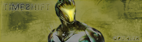
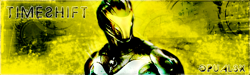
V4 needs way more contrast, V5 needs much less contrast.

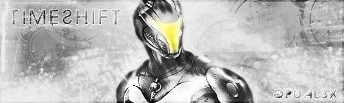
I like V1, personally. Nothing wrong with the brightness. V2, with the bright spots removed, looks too dull.
So you have a really cool background and some effective text, but then your render is just slapped over top. Do something special with it; make it look like it is actually part of the signature! Part of the problem could be its size, in which case there's not a lot you can do about it - I don't think I myself would even attempt to work with a render as small as that in relation to the width of the signature.