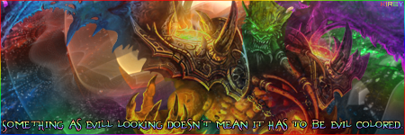
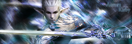
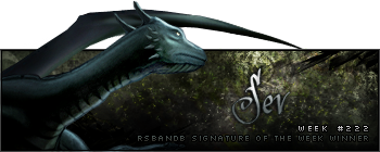
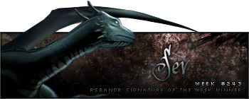
Once again your background is fantastic, but the banner on the whole looks quite flat since there's only that one render in the foreground. Nice contrasting, however the colour could be slightly improved as although you have highlights (nice highlights too) they're pretty much just tints and shades of the one main colour. If possible, try and get some strong red (just a suggestion) in there rather than dark orange, so that it's different, but not too different. I dunno, just some other colour like that I think would look really nice for shadows, you can choose if you're not into red.

Blending is also commendable and all else I can see that needs work is text. Can't always get away with just overlaying it!

While bevel/embossing is usually strongly discouraged, PhoenixEmpire has some very impressive text on his banner
here. I think the same kind of effect would look good here, but I'm not too sure about font. Just mess around and see what looks best.
Hmm. I thought I had something else to say but I just flicked to another tab to read an article and now I've forgotten. XD But yeah, it looks nice, you're definitely improving. Keep it up!


