Flipvlug wrote:
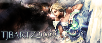
To be honest I'm not too craved about this.. the grunged background has (in my opinion) nothing to do with the rest of the theme and scene, especially with colours. and I just think it's a bit boring to look at ( But that's just me ofcourse )
Perhaps scale the text down a bit, it's taking away ALOT of the focal and is quite overwhelming with the shadow and strong stroke (contrast with text colour).
Perhaps you should make the render a bit more catchy to look at with some elements and attributes?
Sorry if I've been rude
Hey, I never take anything the wrong way. Everything someone says helps eventually. Thanks


