Jamkal wrote:
5/10-didn't know if you wanted it rated or were just showing us all it

-
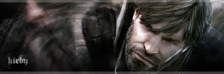
It's pretty good but it could do with a border. Like the post above nothing really pops out at you making it seem a little boring. If there was something in the sig to catch my eyes attention then i would of rated it higher
It has a border. Its black and dark grey.
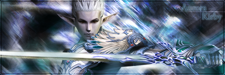
I know what your style of art is like, and I'd say this is pretty good. I think it would be good if you made the focus of light coming from the bottom right corner, and have the front side of the character shaded a bit, then the shade gradiented into the glow thats facing the light source.
I'll give it a 7/10


