Mushroom Queen wrote:
I'm going to take into account that you haven't made a sig in a while since we're both sort of in the same situation. Your sig has some really strange colour issues going on. You used cool-colours (light blue-ish purple) on the left and you have very fiery-looking colours on the right. In this case, they're really clashing and it's making the sig look a little strange.
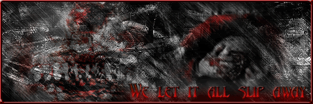
The second problem is a brushing problem. The black brush you used over the render and between the "r" and "a" (in Brad) is wayyyy too dark. It's not a good idea to use such a high-opacity black brush on a render or a sig that doesn't use dark colours.
The last problem is the text, I hate to say. Text is something that IS hard to do for pretty much everyone. The problem with yours isn't really the font as much as it is the lack of effects. Which is not to say that all text needs to have loads of effects. The text in this particular sig looks boring as opposed to looking simple. Find a way to incorporate the text to fit the general feel of your sig. And the font of "ninjagraphx" was a little hard to read..
Last paragraph, I swear. I just wanted to sum up in saying that the main problem with your sig is that the render and text just doesn't fit the background. Hopefully, there could be an easy way to fix this all if you have the .psd (not sure if you used photoshop or gimp) so that you can edit the sig layer by layer. I do like the render though. And I really think you could make this sig look better. Sorry for practically writing novel about one sig. *blush*
She really took all the words out of my mouth. The main thing that I don't like about this one is, well a lot of things. The text needs work. The render does not work well with the brushing and color scheme. Add a little more color to the sig and it will be great. Its just a little too grey to me.