Litis wrote:
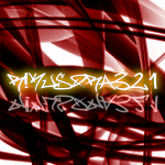
Idiot. If you like the text, it had the gothic effect applied on you.

Calling someone an idiot isn't going to achieve anything but an argument. Please pay mind to what you type to others.
Just looking at your sig, the first problem I see is the render. It's not a very good picture of Aragorn since it's a little blurry and the colours aren't matching anything else in the sig. The second problem is that the sort of "faded" effect of the flames is just oo light and doesn't match anything else on the sig. Here you have gothic looking text, a somewhat unfocused photo of Aragorn, and faded-looking fire. I think it would have looked better with a darker background and a better render. And a new border..but this one isn't too bad.
Overall, I liked that you kept the sig organised and clean-cut. That's what I like to see in sigs and if you take into consideration what I said..I think you can make great sigs.


