|
Adbot
|
Post subject: Register and login to get these in-post ads to disappear  Posted: Posted: February 18th, 2006, 7:58 pm |
|
Joined: September 9th, 2004, 1:47am
Posts: 9047
Location: In your web browserz |
|
|
| Top |
|
|
czskrazzi
|
Post subject: Posted: February 19th, 2006, 3:16 pm |
|
Joined: April 18th, 2005, 12:26 pm
Posts: 3479
RS Status: Classic
|
|
Praises Brad for getting his text good for once..lmao  sorry i had to say it.. sorry i had to say it..
10/10 this is major major improvement. I love this sig, coloring, render, everything is awesome. Great job.
_________________

"Music is the harmonization of opposites; the conciliation of warring elements."
Click here for awesome music by DJ River, downloads are free.
Check out my guide i made.
http://www.myspace.com/krazzicookiemonsta
|
|
| Top |
|
|
durty diap3r
|
Post subject: Posted: February 19th, 2006, 3:28 pm |
|
Joined: January 24th, 2006, 3:55 pm
Posts: 212
Location: Where ever i wanna be!
RS Name: durty diaper
RS Status: P2P
|
|
|
9.8/10 really good!
_________________


|
|
| Top |
|
|
Adbot
|
Post subject: Register and login to get these in-post ads to disappear Posted: February 19th, 2006, 4:58 pm |
|
Joined: September 9th, 2004, 1:47am
Posts: 9047
Location: In your web browserz |
|
|
| Top |
|
|
Chief Snake
|
Post subject: Posted: February 19th, 2006, 9:42 pm |
|
Joined: October 25th, 2004, 10:12 pm
Posts: 3055
Location: New Zealand

RS Name: Chief. Snake
RS Status: Retired
Clan Name: Bits and Bytes
|
|
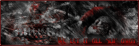
czskrazzi wrote: Praises Brad for getting his text good for once..lmao sorry i had to say it..
That's what I thought... And I dont have a clue what the render is. This was going to be for a Request on NGX but it turned out a lot better than I thought. 
_________________
|
|
| Top |
|
|
Crysala
|
Post subject: Posted: February 21st, 2006, 7:33 pm |
|
Joined: February 16th, 2005, 5:17 am
Posts: 3871
Location: Australia does not pwns you all irl k?
RS Name: Crysala
RS Status: P2P
|
|
|
Looks good. Few things though, the render is unrecognizeable, that should be changed. Its too dark in some places. Text looks good nice job on that. Also like MQ said I would remove the dots, or have less of them. They dont really suit the sig as a whole. And with the border, did you do a white one and just lower the opacity? If you did next time try setting it to overlay instead, trust me it will look better. Right now it looks too white.
|
|
| Top |
|
|
Rafe
|
Post subject: Posted: February 22nd, 2006, 5:58 pm |
|
Joined: December 18th, 2004, 12:21 pm
Posts: 338
Location: Weirdville California
RS Name: RafeForkbed
RS Status: F2P
|
|
|
Good Job - Best art I have seen in a long while.
_________________

|
|
| Top |
|