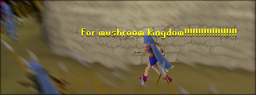
It's oversaturated a little too much. I liked that you used two different fonts, though. I like variety in text.

There's something huge missing in this sig though...add something more! Not necessarily a render, but something that takes away from the bright negative-space that makes my retinas go "aaaaahhh!" I think it's good though. I'd like to see something more done with it. And I don't mind the size either. If you can make use of the entire space, it'd be excellent. Until now, I'll give it a 7.5/10.


