|
Adbot
|
Post subject: Register and login to get these in-post ads to disappear  Posted: Posted: November 2nd, 2005, 11:39 pm |
|
Joined: September 9th, 2004, 1:47am
Posts: 9047
Location: In your web browserz |
|
|
| Top |
|
|
Swarmsnapper
|
Post subject: Posted: November 5th, 2005, 6:01 am |
|
|
|
|
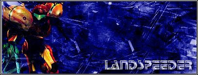
Nope, I'd say there's nothing wrong with the theme and stylizing... but Samus doesn't blend with the background. It's always best to use your render's coloration for the signature background, at least in some small proportion.
Use the oranges, be bold... Samus is a good signature character, but you killed her with a dark blue that has nothing to do with her...
Samus would also fit best in a flowing background, so you should work to use flowing brushes positioned right to add motion to a still image. Your background is very static and tends to make the viewer's eye just get lost in the random lines.
Still, not bad, but correctable to be truly amazing.
|
|
| Top |
|
|
Matt
|
Post subject: Posted: November 6th, 2005, 3:42 pm |
|
Joined: March 16th, 2005, 3:25 pm
Posts: 424
Location: Droppin' the fish off at the pool.
RS Name: Canard
RS Status: P2P
|
|
|
Crysala and Swarm snapper speak of "similar design" but, if you want to go with different colors go completely different. Make the border orange, the text orange, and maybe even add some sort of symbol in the big blank space that you have. You don't have to take this route but it's an alternative to matching colors. (Just don't overuse this "contrasting design")
Also, you should listen to what swarmsnapper said about using flowing brushes in this piece.
- Poison333
_________________
|
|
| Top |
|
|
Adbot
|
Post subject: Register and login to get these in-post ads to disappear Posted: November 6th, 2005, 3:58 pm |
|
Joined: September 9th, 2004, 1:47am
Posts: 9047
Location: In your web browserz |
|
|
| Top |
|


