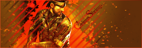
Mushroom Queen wrote:
Can't believe no one's replied to this yet. I love how the edges of the background look simple and then transition into a bright fiery look. I'd rather see the text be a brighter shade of orange/red so it stands out more. And, the black dots on the background would do better if they weren't there (or turned brown). Great job though, Humus! It's a good sig that draws your eye right to the render and text.
Thanks, Mq! 
With the text, I know its kinda lazy, but I just wanted to kind of finish the sig off quickly hehe.. 
All of it was more of a mess-around, experimental kinda thing.