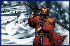
Cowboyofdeath wrote:
These sigs just annoy the hell out of me. Why?
1) The backround and render colors don't match AT ALL.
2) The text has little or no effects on it. It's just text.
3) There was no effort to blend the render.
4) The border poorly fits the overall theme (which should be reddish because of the render)
You get a 5/10. Average.
I actually agree here, I know I am not very good at making sigs, atm I am just working on the bare basics while trying to not kill anything. I am still learning things about layers and effects. I know that with some practice, I will get better. Criticsm (sp?) like this will help me get better, thanks.
_________________
Marking22 wrote:
my life long dream of pokemon being real is coming so close

bloon wrote:
MY ESTROGEN TAKES OVER AND I AM ALL OOOOOOMG *SCREAMFLEE*


