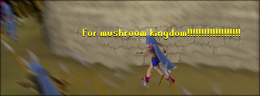
That render is cuuute. Hmm, a few things could be added to make this look better:
The background: What I would do to make the background match the render a little bit would be to add a sort of light pink shade behind the render. It would help balance things out a lot. Also, use the dodge and burn tools to add a little more depth in some areas.
The text: Just change the outer glow from white to light pink.
The border: Lower the opacity to about 50% to make it look softer.
And, well, I know you want a rating but are they really helpful? If I gave you a 8/10 and someone else replied "OMG AWESOME, BLOKE! I WANNA MARRY U 10/10" what good would a rating do?

Not trying to be picky/harsh or anything, I was just wondering why anyone asks for ratings.


