Post new topic This topic is locked, you cannot edit posts or make further replies.  [ 6 posts ] 
Author Message
 Post subject: Another new style
PostPosted: February 7th, 2006, 6:26 am 
Mithril Member
User avatar
Offline

Joined: September 13th, 2005, 9:56 am
Posts: 122
Location: Anywhere u want
RS Status: P2P
Clan Name: Red Devil Clan
Image

made for friend :)

watchathink?

_________________
Image
http://www.ifrogger.com/images/rsbandb/ ... week25.gif
http://www.ifrogger.com/images/rsbandb/ ... week27.gif


Top
 Profile  
 
 Post subject: Register and login to get these in-post ads to disappear
PostPosted: February 7th, 2006, 6:26 am 
Mithril Member

Joined: September 9th, 2004, 1:47am
Posts: 9047
Location: In your web browserz


Top
  
 
 Post subject:
PostPosted: February 7th, 2006, 10:06 am 
Runite Member
User avatar
Offline

Joined: November 9th, 2005, 6:48 am
Posts: 339
Location: in a box behind wall mart
RS Status: Classic
Not bad, im not too fond of the background though. The animation on the sword is a little distracting too.

7/10

_________________
Image
You've never heard of me because I haven't been on the site in almost a year.|Pic of some noob trying to insult a mod.|
|FREE RARES!!!!!!!!!|RSB&B Member 13132|
|My Blog|


Top
 Profile  
 
 Post subject:
PostPosted: February 7th, 2006, 1:05 pm 
Dragon Member
User avatar
Offline

Joined: April 18th, 2005, 12:26 pm
Posts: 3479
RS Status: Classic
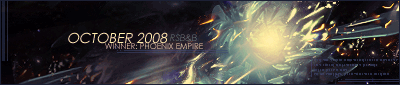
hmm i think its pretty good..font is alil hard to make out..

other than that the only other thing i dont like is the sword, it looks pixeled :?

but 8/10.. its not terrible :P

_________________
Image

"Music is the harmonization of opposites; the conciliation of warring elements."

Click here for awesome music by DJ River, downloads are free.
Check out my guide i made.
http://www.myspace.com/krazzicookiemonsta


Top
 Profile  
 
 Post subject:
PostPosted: February 7th, 2006, 6:10 pm 
Dragon Member
Offline

Joined: April 7th, 2005, 11:02 am
Posts: 4620
Location: Canifis, with the other Russian NPCs de
RS Name: FungiMonarch
RS Status: P2P
Clan Name: The Hot Nuns of Taverley
I wouldn't give it a 7/10. You made great use of the colours in the render and render. The only thing that isn't that great is the text. It's too plain and a little hard to read. I like it though.

_________________
Image


Top
 Profile  
 
 Post subject:
PostPosted: February 7th, 2006, 6:40 pm 
Dragon Member
User avatar
Offline

Joined: May 5th, 2005, 5:56 pm
Posts: 2960
Location: Los Angeles, California ua
RS Status: P2P
Clan Name: Clanless
That is a great sig. The background it very interesting, never seen anything like it before. You also did a great job blending the render into the sig. The only bad thing about the sig is that it is hard to tell what the text says. Mabye make it a little bigger or take some of the effect off of it.

Overall 9/10


Top
 Profile  
 
 Post subject:
PostPosted: February 8th, 2006, 3:38 pm 
Dragon Member
Offline

Joined: November 15th, 2005, 1:48 pm
Posts: 1058
Location: Ye Olde Tavern
RS Name: Da Devil27
RS Status: Classic
Clan Name: Dark Dynasty
i like it.

one thing you could try to do is make the angle of the background match the lean of the render.

overall i love it. really nive work

8/10

_________________
Image Image Image
Image
Image
SOTW Wins: [59] [117] [167] [172] [175] [181] [183]
SOTM Wins: [October 08'] [January 09']
SRSOTW Wins: [2] [3]


Top
 Profile  
 
 Post subject: Register and login to get these in-post ads to disappear
PostPosted: February 8th, 2006, 3:38 pm 
Dragon Member

Joined: September 9th, 2004, 1:47am
Posts: 9047
Location: In your web browserz


Top
  
 
Display posts from previous:  Sort by  

You cannot post new topics in this forum
You cannot reply to topics in this forum
You cannot edit your posts in this forum
You cannot delete your posts in this forum

Jump to: