|
Adbot
|
Post subject: Register and login to get these in-post ads to disappear  Posted: Posted: November 7th, 2005, 1:16 am |
|
Joined: September 9th, 2004, 1:47am
Posts: 9047
Location: In your web browserz |
|
|
| Top |
|
|
Mushroom Queen
|
Post subject: Posted: November 7th, 2005, 11:02 pm |
|
Joined: April 7th, 2005, 11:02 am
Posts: 4620
Location: Canifis, with the other Russian NPCs

RS Name: FungiMonarch
RS Status: P2P
Clan Name: The Hot Nuns of Taverley
|
|
|
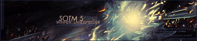
Honestly, the only difference I see in the style is that the render doesn't have any tech brushes covering it. The backgrounds of both your sigs are sort of the same (blue, cloud-ish, with texture brushes added). Try something crazy..like a new colour. Or a different way of doing something. Sticking with the same methods of doing things prevents you from improving.
Aside from that..there are some minor technical things. The border doesn't look that great with it. Do something more with the text. I think that your sigs would look so much better if you left some colour in them. Changing the hue and saturation to pure blue just makes it look plain.
I'll give it a 7/10 because I know you can make great sigs and I just don't think this is one of them.
_________________
|
|
| Top |
|
|
zante4950
|
Post subject: Posted: November 8th, 2005, 3:21 pm |
|
Joined: March 18th, 2005, 9:07 pm
Posts: 686
Location: Im here! Im there! Im everyware!
RS Name: zante4950
RS Status: P2P
|
|
|
make the name look more like a tatoo
9/10
_________________


benny34234 wrote: dam zante u freak'n own! Hate The Game, Not The Player.
|
|
| Top |
|


